Office Color Design Ideas for Better Productivity 2024 Updated
Workplace Inspiration

Office Color Design Ideas for Better Productivity 2024 Updated

|Jan 24, 2022
7,462 Views

While certain environments make you feel duller, do you find yourself happier around certain colors? Have you ever thought about why being surrounded by nature brings the best emotions in you and why a busy city and traffic bring frustration? Our surroundings play a huge role in defining our personality and mood at a said time.

The colors we have around us have a huge impact on our mood and everything we do. This is called color psychology. Similarly, office color design ideas result from carefully researched color psychology. Hence while searching for the right color scheme for offices, you must find the most suitable type of color for your workplace.

In this article, we will cover the office color trends 2022 and the right choice of paint for office interior designs.

What are the Colors for 2022 for Your Office?

Office color trends 2022 are based on the best colors aimed to increase productivity and enhance employee motivation to work. Below are some productive colors for offices so you can set the right office color schemes 2022.

Light Blue Color

Light Blue Color office color design ideas

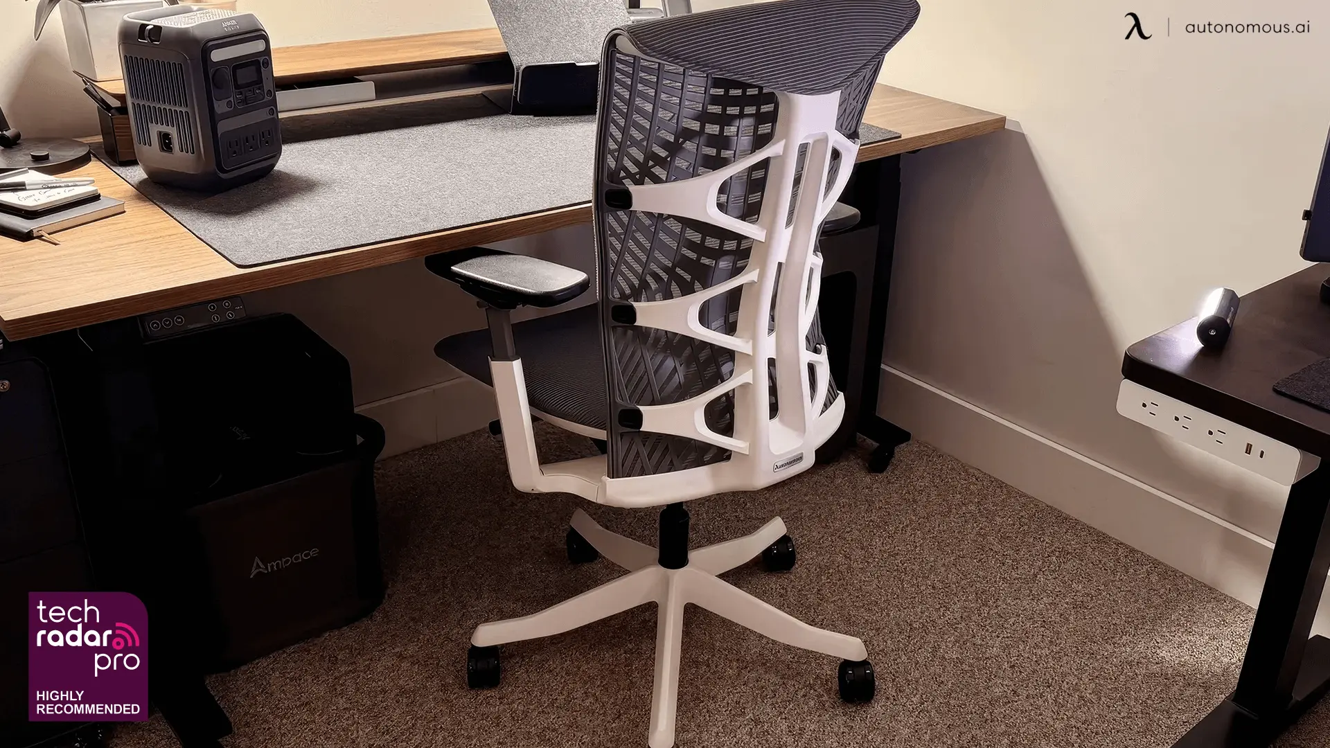
The light color blue is always associated with calmness and peace. Light blue brings calmness into workplaces, and for employees who have work involved with lots of numbers, finance and accounting, blue can be a nice touch for productivity. You can exude confidence and professionalism with a light blue shade from blue walls to a blue office chair.

A tip is to combine blue colors with white to give a detailed interior look. Adding a touch of orange with neutral blue might seem like a bold decision, but in most cases, it works.

Red

Several studies have shown red to raise heart rate and blood flow. Red is your productivity color if your profession needs a lot of physical activity or mental alertness.

However, if red is utilized in excess, it can lead to hostility and competition among teammates. With a neutral palette as the backdrop, this refreshing color is best suited for furnishings and decorations.

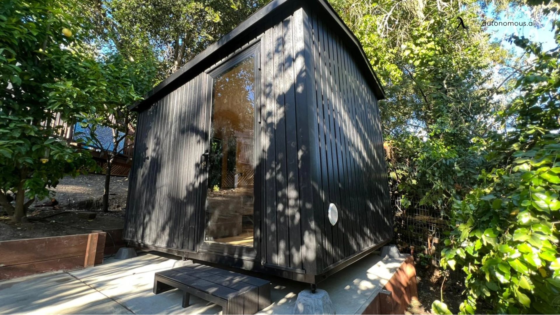
Black

Black office color design ideas

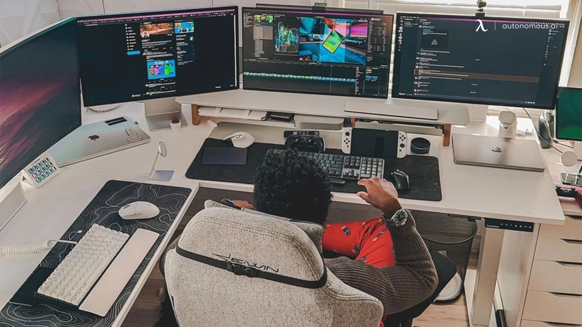
This is one of the common office color design ideas for years. Black offices are very rare, and you are not likely to see a black workplace. Even though black makes a place look smaller, it also exudes confidence and elegance. Black color is also associated with dominance and power, working well for executive rooms and bosses' rooms. A part of why black is one of the most common office desk colors is that they are universal and work with all kinds of themes.

White

Before studying color psychology was even discovered, all of our rooms, bedrooms and workplaces were painted plain white. From modern white desks to plain white walls, you can represent peace and tranquility with white. 

White is also a popular color of all time and will be noted as the most common office color trend 2022 because of its universal friendliness and timelessness.

Off White

Off White office color design ideas

While bright white is very neat and clean, it might also be too loud, especially with the lighting in your workplace. A cream or beige color gives the right hue and mix of white and cream. This blend is excellent to provide calmness in your workplace.

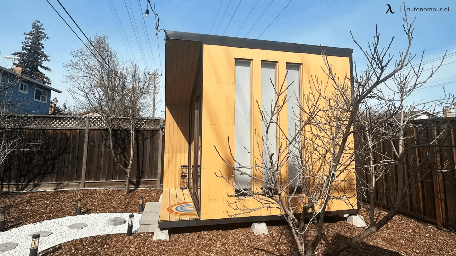
Yellow

This is one of the trendy office color design ideas. Yellow is thought to be the memory color because it increases attention. This means that adding some yellow touches to instructional places can assist your staff in remembering what they've learned.

If you choose the white paint to add a graceful touch of yellow behind your whiteboard in the meeting room, new employees will theoretically absorb more of what is given to them during training. Of course, this leads to increased production.

Orange

Orange office color design ideas

If your staff appear to be sluggish and slow, some orange pops could help to brighten them up. Orange may be found in pillows, flowers, lamps, and even a bowl of fruit on an end table to brighten the day. Alternatively, you may use an orange accent wall. Just be careful not to overdo it.

Green

The color green depicts nature, and the color is highly associated with prosperity. Green is often associated with money, and it is in some ways. Balance, tranquility, and reassurance are all associated with the color green. Green is a good hue for your office if you work in the financial industry.

Brown

Brown office color design ideas

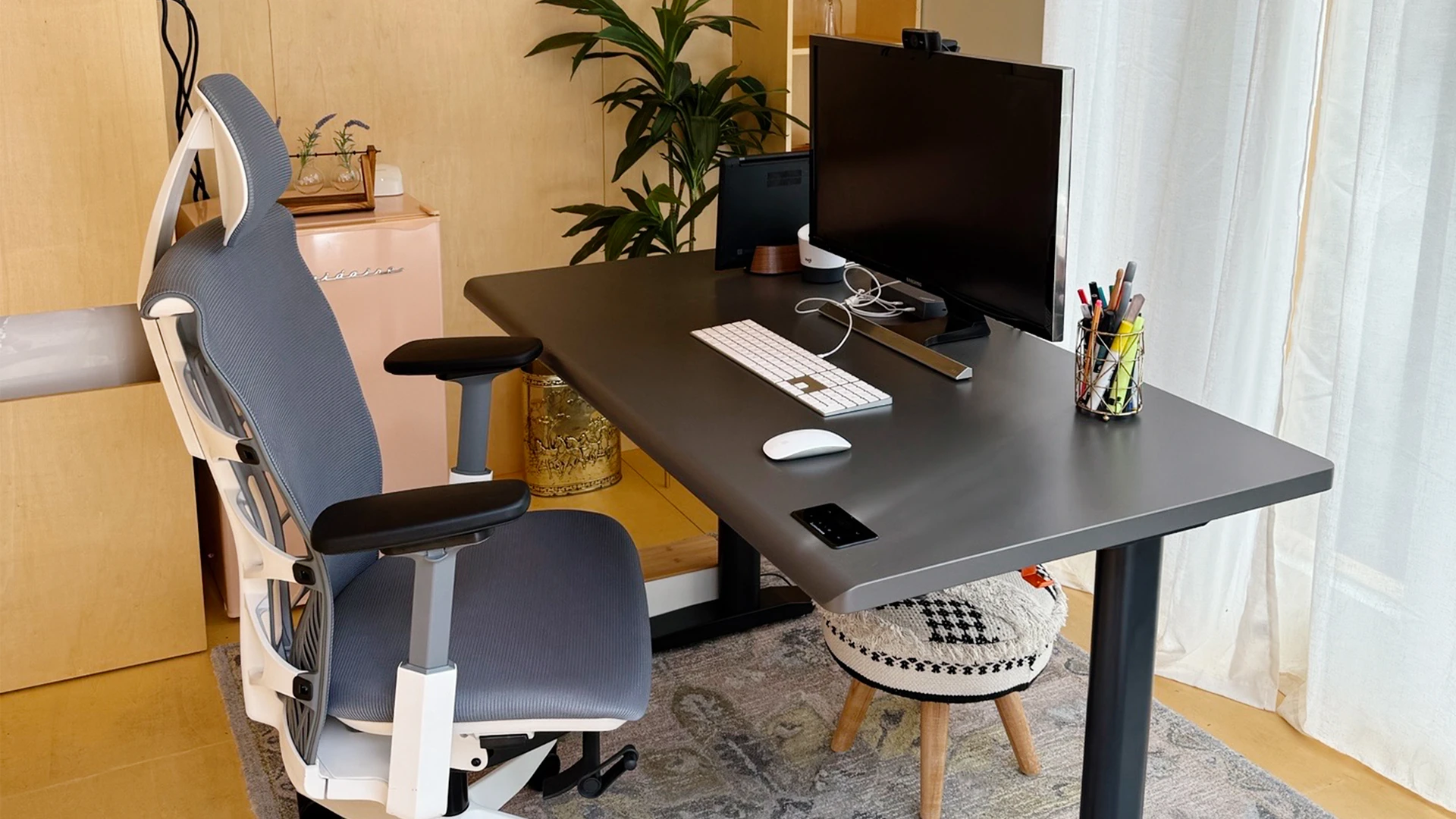
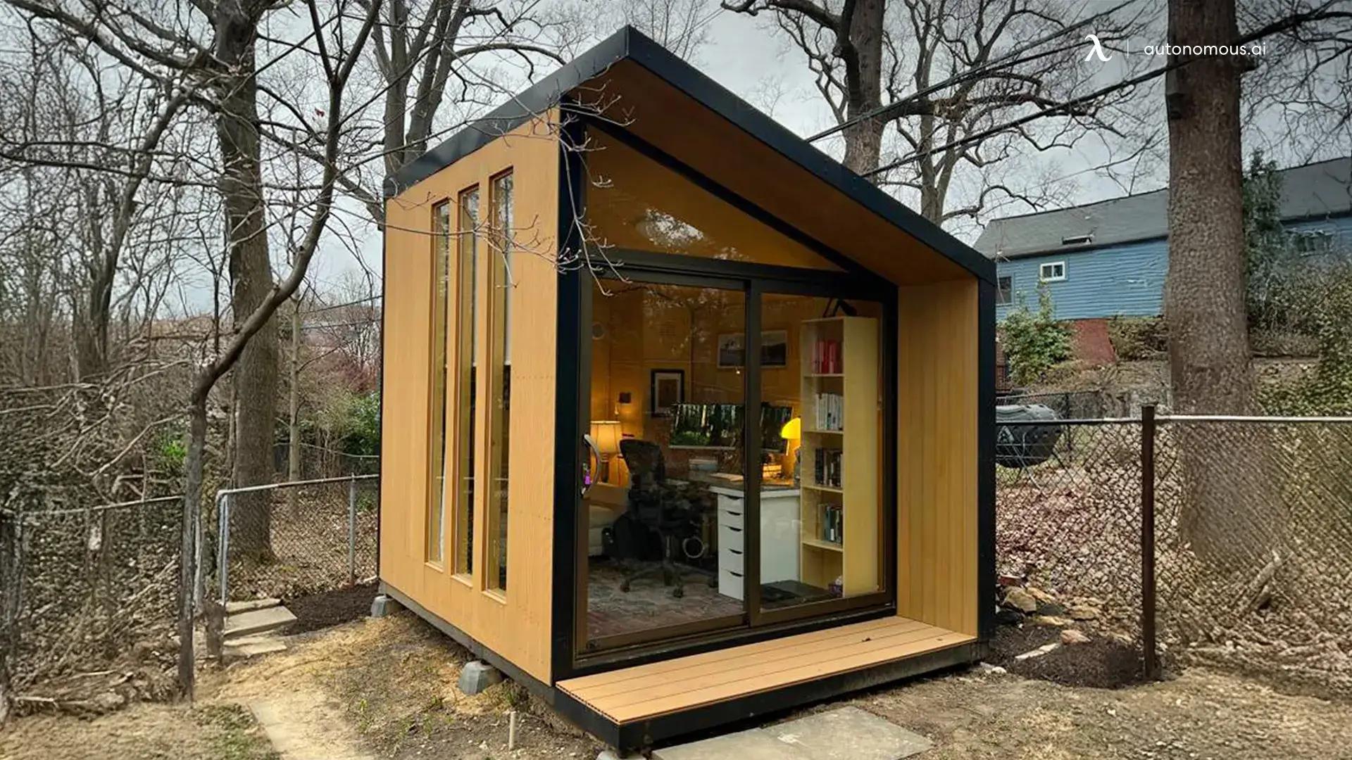
When you combine rich wood furniture with a brown backdrop, you get a workplace that exudes strength, power, and masculinity. Because its earthy tint has the same gloom as black but has more warmth and feels more supportive. At the same time, it denotes hard work and perseverance.

You might add some greens and blues to your workspace to make it less drab. You may also combine it with ivory to create a smart and stylish aesthetic in your office.

Teal

Here is one of the interesting office color design ideas. Teal can transform any workstation into a productivity machine since it is a blend of blue and green. It's crucial to avoid having too much of one color over the other. For the intended impact, brightness and intensity are also vital. Teal looks great in a professional setting, like a lawyer's office. It's a delicate teal with a gray undertone.

Gray

Gray

Gray is a neutral color that sits between black and white. Gray comes in various tints and tones, each evoking a different mood. Classic Gray also has the potential to make your employees, clients, or yourself feel excited about work and the best part? Gray is a unique color for workplaces, so your office might be the only one boasting this color proudly.

How to Choose the Right Color for your Office?

While color psychology is all a result of the universal study, other factors need to be considered when picking up the paintbrush for your office wall. If you hate a color even though it symbolizes productivity, you are likely to get more frustrated than ever and not feel a hint of efficiency.

Another important thing to consider is to choose a color that matches your furniture and other rooms if we talk about the home office setup. By matching and choosing the complimenting colors in your home, you will find the entire setup welcoming rather than frustrating.

What Colors Make a Room Look Bigger?

On the other hand, crisp whites can make a room feel larger and more open, while warm colors can generate a sense of intimacy. Darker colors provide the impression that the surfaces are closer than they are, whereas lighter colors open up a tiny area.

Autonomous Pre-Black Friday Flash Sale 2024

Spread the word